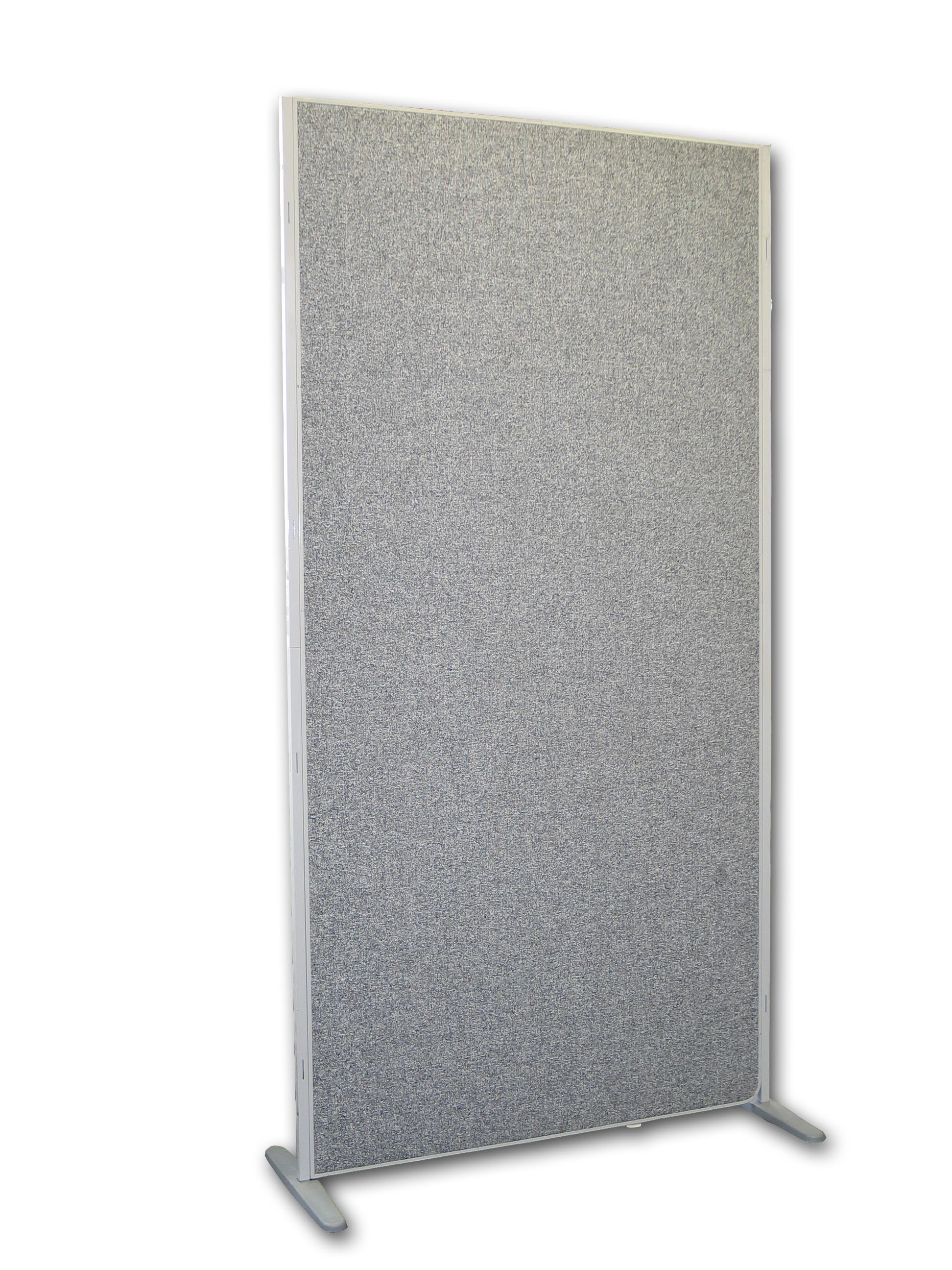
Posters are an integral part of the conference and will remain in place from lunchtime (1pm) Saturday 18th of April until the end of the conference. Poster stands will arrive on Friday morning so poster presenters can set up during the coffee break at 3.30 on Friday (room MAL B02) with the help of a conference assistant.
You could be standing by the poster at any point but the specified time, when you must be there, is 1.30-3pm on Saturday 18 April (room MAL B02).
Size limits and materials

Poster Stand
Each presenter has one front of a whole stand.
Our poster display boards are: 2m x 1m (as in the picture).
So, bear in mind that your poster should be smaller than these dimensions! For instance you could print a poster A2 = 420mm x 594mm.
Besides a display board, the organisation will provide push pins and tables to share.
Tips on poster design
Layout
Divide the contents of your poster into appropriate sections, for example:
- header: including title, author/s, institutional affiliation
- abstract
- methodology
- sources and data
- discussion
- conclusions.
Give credit where it is due. Have an acknowledgements section, in smaller size type, where you acknowledge contributors and funding organisations as appropriate.
Think visual
A poster should emphasize one key idea and clearly demonstrate it. Choose the key idea you want to focus on and how you can best support it through visual (and, secondarily, textual) means.
Use photographs, drawings, graphs, charts and/or tables (colour if possible) to show results. However, include visual material only when it enhances the presentation. Colour is an important tool for making your poster visually interesting and for presenting concepts strategically.
Font (think big)
Make sure your poster can be easily read from about a metre away; use 28-point font for body text (larger for titles and headings). Use clear, simple, dark fonts for all text. Ideally, use no more than one or two different fonts for the poster. Avoid overuse of capitals, italics, underlining and elaborate script fonts. Use bold or a larger size of lettering to achieve emphasis.
Colour
Choose a muted background colour for your poster. Ideally, use no more than three colours. A splash of colour here and there, perhaps highlighting central findings or results, will make your poster stand out.
Be aware of good and bad colour combinations for people who suffer colour-blindness (see more details).
Spacing
Use white space strategically (for aesthetic and conceptual reasons). Filling all available space will make your poster overwhelming to the reader. Use bullet points!
Content
Be concise. Save elaborative points for verbal discussion and interaction with viewers. For conclusions, focus on a central finding that lends itself to informal discussion.
Physical production and transportation
Your institution may have media/audio-visual services available to print and laminate your poster using high-quality materials. They may also have templates specifically for creating large format posters.
If it is digital, remember to make a back-up copy of your poster.
Invest in a mailing tube or portfolio case for transporting your poster.
Poster presentations
More elaborate set-ups than the basic one (poster and shared table) are not encouraged due to limitation of space and logistics. You may need to share with other presenters, so plan your presentation accordingly.
Brief oral overview
When someone approaches you, provide a brief, clear statement of what your poster is about. Then let the audience member ask questions and read the poster and handout if you are providing one. You should be as prepared as if you were going to give an oral presentation, but the goal is to have a more informal exchange.
Be available
Stay by your poster, but give people time and space to view your materials.
Additional materials and audience
Have a notepad handy when presenting at your poster session. It may be helpful in elaborating on your findings, or for taking names and addresses of people interested in your research. Bring handouts and copies of your abstract to give to other delegates. Consider making available copies of your business card (or a similar slip of paper with your contact information).
Find out who are the people interested in your poster and what they are working on. You may make a valuable contact with someone who shares your research interests.
All abstracts of poster submissions are included in the list of abstracts on this website.
Contact us
For any queries on these guidelines please contact the steering committee.
